The Overview
Windows 8 is meant to be the tablet operating system that can use a mouse and keyboard as well. Microsoft has been caught off guard by Apple’s iPad and other similar gadgets such as the Playbook by Blackberry.
The new operating system will have a couple UI, a metro look along with access to the Windows UI that we are familiar with. By the sounds of Windows 8 apps, it appears that Windows 8 will also take a different app structure while keeping the compatibility standards of Windows 7.
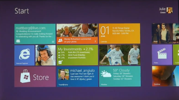
Apps will be represented by tiles. The reason Microsoft chose tiles is so that information can be displayed. The video used the weather app as an example. Without even clicking or touching it, it will give you the current conditions and forecast for your area.
New App Structure and Browsing Methods
Windows 8 will also feature applications written in html5 and java script directly from the new UI.
With a swipe to the left, more apps and options become available. We have yet to see whether all of this is customizable or if this is a default layout having email and and certain apps on the first screen and the files and desktop on the right side to be scrolled to.
The apps are full screen and tend to stick to the design of the start page for a smooth transition.
The new UI will also show you the time and a sort of navigation bar on the right when you touch the screen and the Start button which is covered by the finger in the image above is the way that users go back.
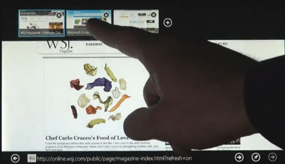
The new interface also allows users to scroll through open apps in full screen by swiping across. We have yet to see how all of these new UI adjustments would work with a keyboard and mouse.
The apps that can be ran in full screen mode include a browser and media application, along with others.
Above are the Internet Explorer app and a media player app.
Integrating the Old into the New… File Systems and Snap
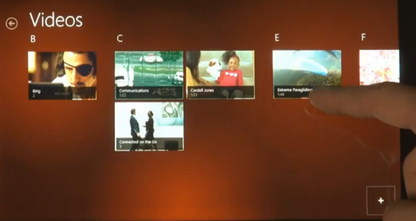
Browsing your files in this new interface is also interesting, below is a screenshot of the Videos folder as seen in the new UI.
When you click or touch one, it will open and play in a full screen app.
If you swipe in halfway to the center and hold until it snaps, the UI will allow you to snap apps side by side and allow you to adjust their relative sizes.
By flicking through the apps, you can change the larger screen while keeping the smaller screen snapped.
A New Internet Explorer and a New Touch Keyboard
Internet Explorer is a full screen app, as mentioned earlier and will hide all controls unless they are triggered. Once triggered, it will look like the following.
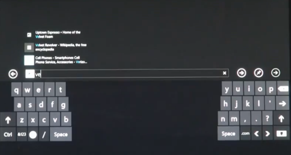
When the a user touches the address bar to put in a new link, IE activates an onscreen keyboard and overview of frequently used applications.
The keyboard can be adjusted to become a thumb keyboard to make it easier for those who hold a tablet on both sides.
It is a Dual UI and Both UIs can be Snapped Side by Side
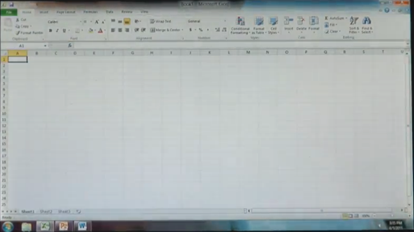
The new interface will also feature apps like Office and Office will open in the other UI and be used like users would use it on Windows 7.
Unlike many leaked builds, there is no profile applet on the right side of the taskbar.
These apps can be used ‘along side new Windows 8 apps.’ Just like you could snap two programs in the new UI and the old one, you can even have both UIs side by side.
Pull from the left part way, hold and it will snap.
Windows Explorer Gets the Ribbon
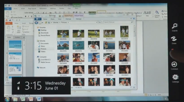
Windows 8 will keep the file system. Note that what seems to be a menu on the top is actually a collapsed ribbon. Windows Explorer will have a ribbon. It will also have a quick launch bar and the buttons to close and minimize an app have been enlarged for touch.
New UI Overlaps Old
On the side will be that new toolbar where you can access the start UI again and go from there. Everything is seamlessly carried through.
Access Anything in any UI
Files can easily be accessed by Windows 8 apps and the new Windows Start UI.
You will also be able to access files from networks in the new Start up UI. The pictures scroll sideways and flicking to the left or right will take you to a different part of the library.
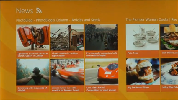
The UI will allow users to access files from places like Feedr and other services straight from the UI.
Directly from Boot-up or from Locking
Below is how Windows will look when it is locked or loaded from boot. Swiping up will access the account login.
You can stay tuned for other updates at http://www.buildwindows.com/.
Microsoft has revealed their rival Operating System to both the iOS and Mac OS X Lion for PCs and tablets. What do you think of Windows 8? Despite the many questions as to how non-touch users will be able to interact with it, whether it will work properly on existing hardware and how it will affect overall performance, what do you think of the new OS?












0 Blogger:
Post a Comment