
Google is revamping its services. Gmail got a makeover, Calendar got a makeover, Google Reader got a makeover, and Blogger in Draft just introduced its makeover.
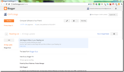
If you like streamlined options all in one Dashboard, then you are in luck. The new look of Blogger puts you in control of everything in one slic interface.
If you ever wanted thorough access to your stats, Blogger now offers it. Every article in the Post manager has its stats and comments count on the right side. That will accommodate for the limited data that stats gives – but can be remedied with Google Analytics.
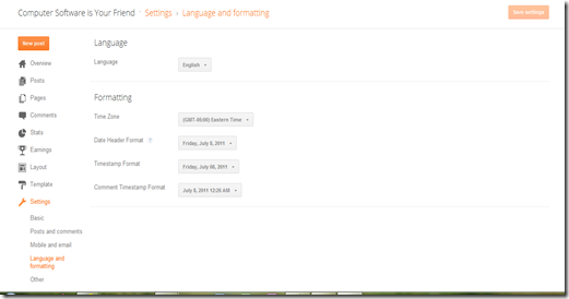
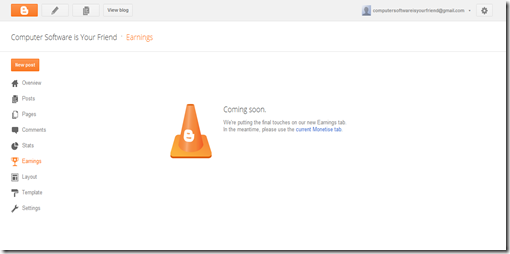
All of the settings that used to be in tabs on top are now in a list in a left-hand sidebar. All drop menus are available there as well.
If you go to the stats, you will find the time manager on the top right corner. It now defines what the time interval is.
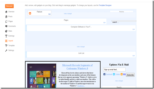
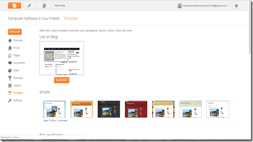
The Design Tab has been completely dismantled. Layout, which used to be a sub tab is now front and center as an independent tab.
The rest of the options are found in template. If you need to edit the html, you will need to scroll down and expand Edit Template.
Unfortunately, the rest of the top on top isn’t collapsible.
The settings are much less intimidating. The new organization minimizes the tabs and minimizes the options.
Something noteworthy is that in the Posts and Comments section, there is a new option that allows you to give every post a template.
The question marks give you a brief description of the setting.
If you click add, it gives you a text box.
Those of you that use Google’s Monetization service should note that it will be transferred to the Earnings tab and will be getting a makeover of its own.
On the top left corner, there are 4 buttons. The left most one is the Home button which takes you to the main dashboard. The second one allows sends you to the post editor. The third to the post manager. The last takes you to your blog.
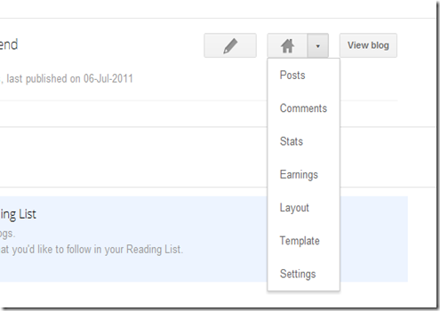
In the main dashboard, you can still access the menu items as you did before, just they have all been stored away in the Home dropdown.
If you like this new layout and want to try adapting to it, go to http://draft.blogger.com. If you like it, make it your default start page.
If you want to request an overview, you can do so by filling out this form. For more updates, join us on Facebook and Twitter. Feel free to +1 this article and share it with your friends on Google.
Blogger Gets a Makeover
Julian
Wednesday, July 13, 2011
![]() About Author
About Author
Julian enjoys fiddling with software and has recently been able to get Windows 8, Mac OS X and Ubuntu to play nice on one machine.
Contact him on Twitter @JulianCWolfe








0 Blogger:
Post a Comment