Rumored to release at the end of the month and already the social network of millions of people, Google + has re-innovated the way that people social network. Overall, it puts privacy in your hands and offers features that Facebook doesn’t have.
Home Sweet Home
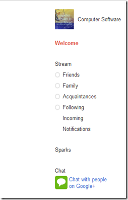
Once you have signed up, you will be taken to the welcome screen. The welcome screen outlines the major features in the field trial of Google Plus.
On the left hand side, you will see all of your Stream – which can be filtered by all of your Circles, Sparks and Contacts in Chat.
On the top will be your view toggle and contact search.
Above that, as part of Google’s main service bar, is the notifications area and settings – both tucked away to the right.
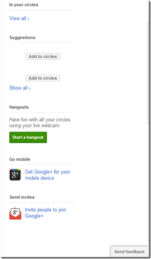
And on the right you will find the total count of all your circles – this includes duplicates if people are in 2 or more circles, suggestions – which have been removed for privacy reasons, the link for hangouts, a link for mobile devices, the invite button and on the bottom right corner of the browser window, a send feedback button.
Your Pictures in One Place
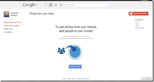
Toggling over to the next button in the top bar, you get all of the photos that you shared and all of the photos in your circles in one place.
On the top right corner of that view, you have the option to upload pictures and see your existing albums.
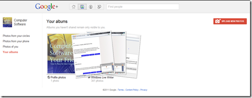
The albums are synced with your Picasa albums by default and if you hover over one, you get an animation that toggles this view of the album.
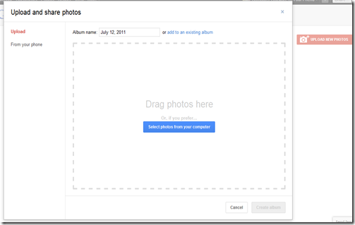
Uploading new photos is easy, all you need to do is select and import the pictures to a new or existing Picasa album. If you have a mobile phone, Google + has built in integration to access those pictures as well.
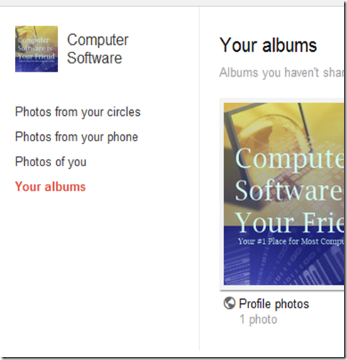
The left hand side allows you to toggle the pictures based on circles, mobile uploads, your profile and your albums.
Viewing pictures is an overall nice experience. When you click on the picture, it will open an overlay that allows you to comment on the right hand side.
Associated with your images come tasks. You can add a caption, tag a friend, see the picture details, rotate it left or right, edit, delete or report it. You can also manage your comments in that menu by reporting or deleting unwanted ones.
One thing that you cannot do in Facebook is refine your images. However, Google Plus doesn’t have built in crop like Facebook does.
Your Profile
Perhaps you did not know this, but your Google + profile is your Google profile and is currently set to be visible to everyone and to search engines. None the less, a bit of tweaking will remove that default setting and allow you to take full control of your profile.
The profile looks like the old Facebook where you had tabs for your pictures and information on the top, a profile image on the left with the send a message box – which needs to be activated in the settings – and then a view of friends and common friends.
Google + takes a different approach to ‘friends’. In simple terms, you follow who you want to follow and your friends will follow who they want to follow by making circles. There is no invitation, nor a request, nor do you know how the other person has sorted you. Essentially, you follow your buddy, and whatever they do comes in your stream. If they add you in their circles, you will be notified of so and they will be seeing your updates in one of their circles.
Taking a closer look at the tabs and overall top view, you note two interesting things. One, an edit profile button, and second a View profile as search list.
If you were to follow Computer Software is Your Friend on Google +, you would see something different than I do.
You will not see the red bar that is telling me who’s perspective I am seeing the profile from, but you should notice that the +1 tab is missing, and so is the circles, and if I had more posts and personalized them, some would also be missing.
This is an interesting feature because sometimes you want to make sure that the message between you and Person A was between you and Person A and sometimes you want to make sure that person A can see something on your profile – maybe something that others can’t. You can toggle the view profile as, but for the general public, that is how it will look like – if the profile isn’t completely blocked from their viewing.
Editing Your Profile
This is a brief look at editing your profile. Once in, you can edit each aspect individually and decide who sees what aspect.
Your Circle of Life
Forget about groups, Google has a more lively way of sorting your contacts – with animations too.
The circle above should tell you everything, but in case you were too distracted by its polished look despite being in beta, here is Circles.
Essentially, you drag contacts from above, which is sorted by who is already in circles, has added you into theirs and your contact sheet from imported accounts.
Once you drag a contact to a circle, it opens up and a +1 floats above it. remove a contact, and you see –1 and a cloud that goes poof. In a lot of ways, this is something you would expect from Mac OS X… especially the poof…. Well, the reason is Google had a Mac developer help them out, and based on the top bar with the page toggle, it shows.
Want to See it for Yourself? Fill out this form and we will send you an invite to your Gmail account! For more details, follow us on Facebook and Twitter.






0 Blogger:
Post a Comment